Before and After Photo Maker
Your photos
Before
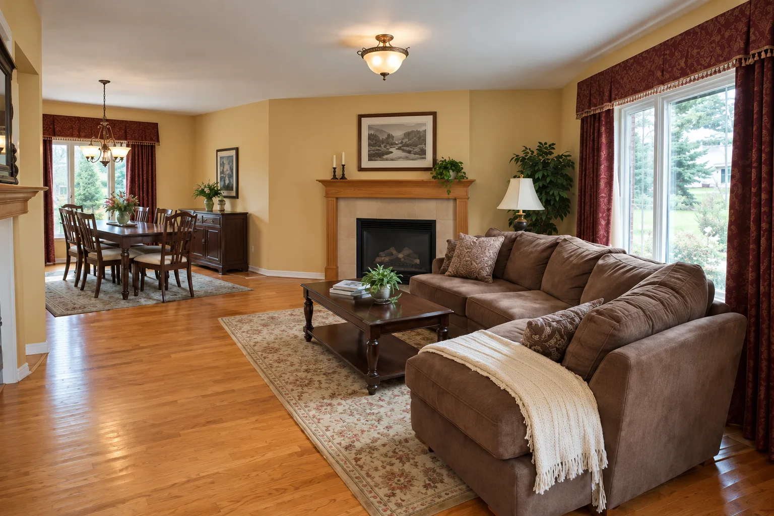
Sample photo1536 × 1024 px
After
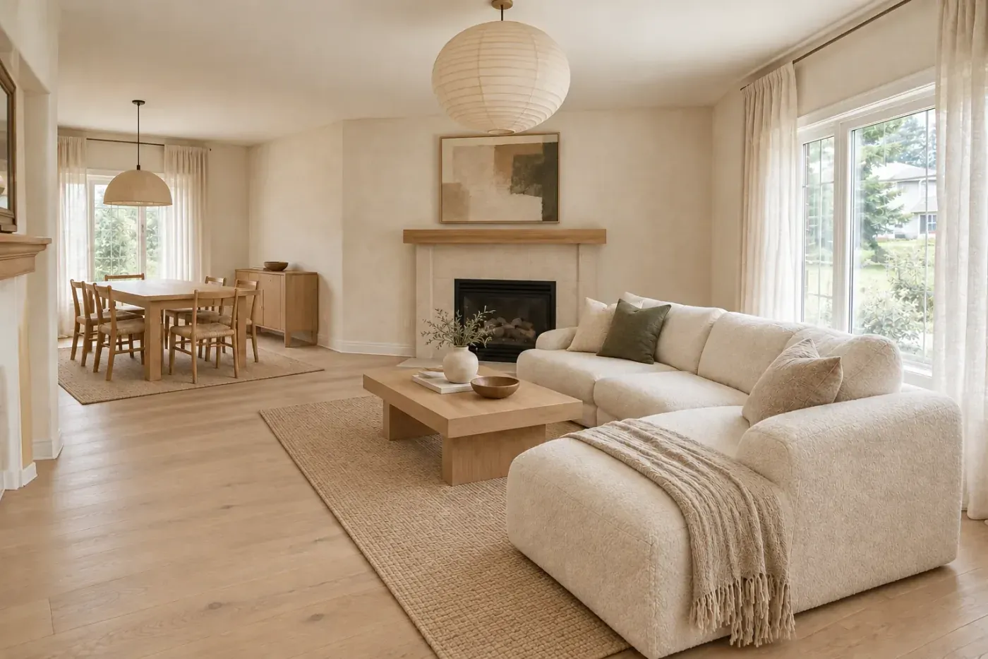
Sample photo1400 × 933 px
Your photos stay on this device: nothing is uploaded. Drop, pick or paste (Ctrl/⌘ + V) JPG, PNG, WebP or iPhone HEIC photos; drop two at once to fill both.
Fit and align
Use zoom and shift when the after was taken a step closer or further away.
Slider style
Where the divider rests in the embed and where the video ends.
Preview
Drag the handle, or focus it and use the arrow keys.
Sample pair: the after is an AI render made with the Style Swap workflow. Exports at 1600 × 1067 px (3:2).
Download images
Aligned photos for the embed
Animated wipe video
A short clip that wipes from before to after, for Reels, TikTok, Stories and listing videos. It records in real time, so keep this tab open while it runs.
Format
Checking…
Embed code for your website
Upload the two aligned JPGs to your site, paste their links here, then add the code to an HTML or code block. No library, no account; it uses your slider style above.
Alt text for screen readers and search.
A small “Slider made with AI Room Designer” line under the slider. Optional.
<div class="ba-slider" data-direction="horizontal" data-handle="circle" style="--ba-pos:50%;aspect-ratio:1000 / 667">
  <img src="https://example.com/after.jpg" alt="After" loading="lazy" decoding="async">
  <div class="ba-before">
    <img src="https://example.com/before.jpg" alt="Before" loading="lazy" decoding="async">
    <span class="ba-label ba-top ba-left" aria-hidden="true">Before</span>
  </div>
  <div class="ba-after-side"><span class="ba-label ba-top ba-right" aria-hidden="true">After</span></div>
  <input class="ba-range" type="range" min="0" max="100" step="1" value="50" aria-label="Compare before and after photos" aria-orientation="horizontal" aria-valuetext="50% before, 50% after">
  <span class="ba-line" aria-hidden="true"><span class="ba-knob"><svg viewBox="0 0 256 256" fill="currentColor" aria-hidden="true"><path d="M237.66 133.66l-32 32a8 8 0 0 1-11.32-11.32L212.69 136H43.31l18.35 18.34a8 8 0 0 1-11.32 11.32l-32-32a8 8 0 0 1 0-11.32l32-32a8 8 0 0 1 11.32 11.32L43.31 120h169.38l-18.35-18.34a8 8 0 0 1 11.32-11.32l32 32a8 8 0 0 1 0 11.32z"/></svg></span></span>
</div>
<p class="ba-credit">Slider made with <a href="https://www.airoomdesignapp.com/tools/before-and-after-slider">AI Room Designer</a></p>
<style>
.ba-slider{position:relative;overflow:hidden;width:100%;border-radius:8px;background:#e9e6df;touch-action:pan-y;user-select:none;-webkit-user-select:none;cursor:ew-resize}
.ba-slider[data-direction=vertical]{cursor:ns-resize}
.ba-slider img{position:absolute;inset:0;width:100%;height:100%;object-fit:cover;display:block;max-width:none;pointer-events:none;-webkit-user-drag:none}
.ba-before,.ba-after-side{position:absolute;inset:0;pointer-events:none}
.ba-before{clip-path:inset(0 calc(100% - var(--ba-pos)) 0 0)}
.ba-after-side{clip-path:inset(0 0 0 var(--ba-pos))}
.ba-slider[data-direction=vertical] .ba-before{clip-path:inset(0 0 calc(100% - var(--ba-pos)) 0)}
.ba-slider[data-direction=vertical] .ba-after-side{clip-path:inset(var(--ba-pos) 0 0 0)}
.ba-label{position:absolute;margin:12px;padding:4px 8px;border-radius:6px;background:rgba(255, 255, 255, 0.95);color:#1c1b19;font:600 12px/1.2 system-ui,-apple-system,"Segoe UI",sans-serif;letter-spacing:.06em;text-transform:uppercase;box-shadow:0 1px 3px rgba(0, 0, 0, 0.28)}
.ba-top{top:0}.ba-bottom{bottom:0}.ba-left{left:0}.ba-right{right:0}
.ba-range{position:absolute;inset:0;width:100%;height:100%;margin:0;opacity:0;pointer-events:none}
.ba-line{position:absolute;top:0;bottom:0;left:var(--ba-pos);width:2px;margin-left:-1px;background:#ffffff;box-shadow:0 0 4px rgba(0, 0, 0, 0.28);pointer-events:none}
.ba-slider[data-direction=vertical] .ba-line{left:0;right:0;bottom:auto;top:var(--ba-pos);width:auto;height:2px;margin:-1px 0 0}
.ba-knob{position:absolute;left:50%;top:50%;width:44px;height:44px;transform:translate(-50%,-50%);display:grid;place-items:center;border-radius:50%;background:#ffffff;color:#1c1b19;box-shadow:0 2px 8px rgba(0, 0, 0, 0.28);pointer-events:auto;touch-action:none}
.ba-knob svg{width:22px;height:22px}
.ba-slider[data-direction=vertical] .ba-knob svg{transform:rotate(90deg)}
.ba-slider[data-handle=square] .ba-knob{border-radius:8px}
.ba-slider[data-handle=line] .ba-line{width:4px;margin-left:-2px}
.ba-slider[data-direction=vertical][data-handle=line] .ba-line{width:auto;height:4px;margin:-2px 0 0}
.ba-slider[data-handle=line] .ba-knob{background:transparent;box-shadow:none}
.ba-slider[data-handle=line] .ba-knob svg{display:none}
.ba-range:focus-visible+.ba-line .ba-knob{outline:3px solid #2f55d4;outline-offset:2px}
.ba-credit{margin:6px 0 0;font:12px/1.4 system-ui,-apple-system,"Segoe UI",sans-serif;color:#5f5b55}
.ba-credit a{color:inherit}
</style>
<script>
(function () {
  document.querySelectorAll(".ba-slider:not([data-ba-ready])").forEach(function (root) {
    root.setAttribute("data-ba-ready", "");
    var range = root.querySelector(".ba-range");
    var knob = root.querySelector(".ba-knob");
    var vertical = root.getAttribute("data-direction") === "vertical";
    var dragging = false;
    function set(pos) {
      pos = Math.max(0, Math.min(100, pos));
      root.style.setProperty("--ba-pos", pos + "%");
      range.value = String(Math.round(vertical ? 100 - pos : pos));
      range.setAttribute("aria-valuetext", Math.round(pos) + "% before, " + Math.round(100 - pos) + "% after");
    }
    function fromPointer(event) {
      var box = root.getBoundingClientRect();
      set(vertical ? ((event.clientY - box.top) / box.height) * 100 : ((event.clientX - box.left) / box.width) * 100);
    }
    range.addEventListener("input", function () {
      set(vertical ? 100 - Number(range.value) : Number(range.value));
    });
    root.addEventListener("pointerdown", function (event) {
      if (event.pointerType === "mouse" && event.button !== 0) return;
      if (vertical && event.pointerType !== "mouse" && !knob.contains(event.target)) return;
      dragging = true;
      root.setPointerCapture(event.pointerId);
      if (event.pointerType === "mouse") fromPointer(event);
    });
    root.addEventListener("pointermove", function (event) {
      if (dragging) fromPointer(event);
    });
    function stop() { dragging = false; }
    root.addEventListener("pointerup", stop);
    root.addEventListener("pointercancel", stop);
    set(parseFloat(root.style.getPropertyValue("--ba-pos")) || 50);
  });
})();
</script>
Example links are filled in until you add your own.
How do you make a before and after slider?
A before and after slider stacks two photos of the same view and lets the viewer drag a divider to reveal one over the other. This before and after photo maker builds it in five steps, all in your browser:
- Add the two photos. Drop them on the Before and After boxes, pick them from your files or paste them. iPhone HEIC photos are converted on your device.
- Choose one shape. Both photos are fitted to it. Crop to fill trims the edges; letterbox keeps the whole photo and adds bars.
- Line them up. Zoom and shift the after photo until fixed points, such as a window frame or a door edge, sit in the same place.
- Style the slider. Set the direction, the two labels, where they sit, the handle and where the divider starts.
- Export. Download a split PNG, a side-by-side PNG, a wipe video or the embed code for your site.
How do you line up before and after photos?
The tool scales both photos to one frame. Crop to fill scales a photo until it covers the frame and trims what spills over, so the slider has no bars. Letterbox scales it until it fits inside and fills the gap with white or black, so nothing is lost. The before photo is always centered; the after photo gets zoom (100–200%) and a shift on each axis, because it is usually the one taken later from a slightly different spot.
The share a crop removes depends only on the two shapes. These worked examples use the same geometry as the downloads:
Example 1: a phone photo in a 3:2 slider
A 4032 × 3024 px phone photo is 4:3. Cropped to fill a 3:2 frame it loses 11% of its area, a strip from the top and bottom. Keep ceilings and floors in the middle of the shot so that strip is safe to lose.
Example 2: an AI render next to a phone photo
A 1536 × 1024 px render is 3:2. With the shape set to match a 4:3 before photo, the render loses 11% of its area from the sides. Zoom stays at 100%; shift it sideways if the sofa or window sits off-center.
Example 3: a landscape room in a vertical video
Cropping a 3:2 photo to 9:16 for Reels or TikTok cuts 62% of it. Either letterbox it, or set the direction to top–bottom and shoot the next pair in portrait so the room fills the frame.
What size should before and after photos be?
Both photos in a slider must share one width, height and framing, or the divider reveals a jump. The tool exports every file at the size below for the shape you choose.
| Shape | Typical use | 1080 px | 1600 px | 2048 px |
|---|---|---|---|---|
| 3:2 | Camera photos, portfolios | 1080 × 720 px | 1600 × 1067 px | 2048 × 1365 px |
| 4:3 | Phone photos | 1080 × 810 px | 1600 × 1200 px | 2048 × 1536 px |
| 16:9 | Website banners, landscape video | 1080 × 608 px | 1600 × 900 px | 2048 × 1152 px |
| 1:1 | Square posts | 1080 × 1080 px | 1600 × 1600 px | 2048 × 2048 px |
| 4:5 | Portrait feed posts | 1080 × 1350 px | 1600 × 2000 px | 2048 × 2560 px |
| 2:3 | Pins | 1080 × 1620 px | 1600 × 2400 px | 2048 × 3072 px |
| 9:16 | Reels, TikTok, Stories | 1080 × 1920 px | 1600 × 2844 px | 2048 × 3641 px |
| Where | Shape | Size | What the source says |
|---|---|---|---|
| Website slider | 16:9 | 1920 × 1080 px | Full HD is optimal, 2560 × 1440 the maximum; keep each image under 1 MB. Elfsight (opens in a new tab) |
| Pinterest pin | 2:3 | 1000 × 1500 px | Taller pins may be cut off in the feed. PNG or JPEG. Pinterest Business (opens in a new tab) |
| TikTok video | 9:16 | 540 × 960 px | Vertical 9:16 is recommended; 540 × 960 px is the minimum, so export larger. TikTok Ads (opens in a new tab) |
How do you take good before and after photos of a room?
A slider only convinces when the two photos differ in the room, not in the camera. Real estate agents, stagers and designers get there with the same habits:
- Same spot. Mark where you stand with painter’s tape, or leave a tripod’s feet marked, and shoot the after from the exact place.
- Same height and lens. Keep the camera at the same height and use the same zoom. Switching between a phone’s wide and ultra-wide lens changes the perspective and can’t be fixed with a crop.
- Same light. Shoot at the same time of day with the same lamps on or off, so the change reads as the room, not the sun.
- Straight verticals. Hold the camera level so door frames and wall corners stay upright in both shots.
- Same staging rules. Clear the same surfaces in both, or the clutter becomes the story.
Where should you use a before and after slider?
Each export suits a different place. The interactive slider needs a page that runs scripts; everywhere else, use an image or the video.
| Where | Best format | Why |
|---|---|---|
| Your website or portfolio | Embed code | Visitors drag the divider themselves. |
| Instagram, TikTok, Stories | Wipe video | Feeds don't run sliders; motion shows the change. |
| Split or stacked PNG | Pins are still images; 2:3 is the recommended shape. | |
| Email and newsletters | Split or side-by-side PNG | Email clients don't run scripts. |
| Proposals and slide decks | Side-by-side PNG | Both states stay visible on a printed page. |
| Listing videos and messages | Wipe video | Plays anywhere a video does. |
How do you add a before and after slider to a website?
Download the aligned before and after JPGs, which are already cropped to the same size, and upload them to your site. Paste their links into the embed panel, describe each photo for screen readers, and copy the code. In WordPress, paste it into a Custom HTML block; site builders call the same thing a code or embed block.
The code is plain HTML, CSS and a short script with no library. The handle responds to mouse, touch and the arrow keys, and screen readers announce it as a slider with the split as a percentage. Images load lazily, so a slider lower on the page doesn’t slow the first screen. Elfsight’s slider guide suggests keeping each image under 1 MB (Elfsight (opens in a new tab)); the tool shows the size of every JPG it saves.
Is this before and after photo maker private?
Yes. It is a free, non-AI tool that runs entirely in your browser: your photos are decoded and drawn on your device, and the downloads are made in memory. Nothing is uploaded to us, and there is no account or watermark.
The wipe video uses the browser’s own recorder, MediaRecorder, on a canvas stream (MDN (opens in a new tab), MDN (opens in a new tab)). Chrome can save MP4 since version 126 (Chrome (opens in a new tab)) and Safari has supported recording since 14.1 (Apple (opens in a new tab)); where MP4 isn’t available the tool saves WebM.
Sources
Sources
Last verified:
- Pinterest Business: Pinterest product specs (opens in a new tab)
- TikTok Ads: Auction In-Feed Ads specs (opens in a new tab), June 2026
- Elfsight: Image upload guidelines for the Before and After Slider widget (opens in a new tab), Sep 23, 2026
- Chrome for Developers: Chrome 126 release notes (opens in a new tab), Jun 11, 2024
- Apple Developer: Safari 14.1 release notes (opens in a new tab), Apr 26, 2021
- MDN Web Docs: MediaRecorder (opens in a new tab), Oct 7, 2026
- MDN Web Docs: HTMLCanvasElement: captureStream() method (opens in a new tab), Jun 23, 2025
FAQ
Before and after slider questions
How do I make a before and after slider?
Add your before and after photos to the maker above, pick a shape and choose crop or letterbox so the two line up. Zoom or shift the after photo if it was taken from a slightly different spot, set the labels and handle, then download the split image, record a wipe video or copy the embed code.
How do I add a before and after slider to my website?
Download the two aligned JPGs, upload them to your site's media library and paste their links into the embed panel. Copy the code into an HTML or code block (a Custom HTML block in WordPress, for example). The code has no dependencies and runs on any page that allows HTML with a script.
What size should before and after slider images be?
Both images should have exactly the same width, height and framing. Elfsight's slider guide calls 1920 × 1080 px optimal, with 2560 × 1440 px as the maximum and each file under 1 MB. For most pages, the 1600 px export here is sharp enough and loads faster.
Can I make a before and after video for Instagram or TikTok?
Yes. Choose the 9:16 shape, then record the animated wipe. It saves an MP4 where the browser supports it and a WebM otherwise. TikTok recommends vertical 9:16 video of at least 540 × 960 px; the 1080 px export is double that.
Are my photos uploaded anywhere?
No. The slider maker runs in your browser: photos are decoded, aligned and exported on your device, and nothing is sent to our servers. The embed code only points at images you host yourself, so the slider on your site loads from your own storage.
Why don't my before and after photos line up?
They were usually taken from a different spot, height or zoom. Choose one shape for both, then use zoom and the two shift controls to move the after photo until fixed points such as a window frame or door edge match. Next time, shoot both from the same marked spot with the same lens.
Can I use a before and after slider in an email?
Not as a slider: email clients don't run scripts, so the handle can't move. Use the split image or the side-by-side PNG in emails and newsletters, and link it to the page where the interactive slider lives. A short caption such as “Drag to compare on our site” tells readers there is more to see.
Is there a free before and after photo app?
This before and after photo maker is free and needs no app or sign-up: it runs in any current phone or desktop browser. It makes the slider, the side-by-side image, the wipe video and the embed code from photos you already have.
How can I show the after before a room is renovated?
Use a visualization of the finished room as the after. In AI Room Designer, a paid app that uses credits, you upload a photo of the room and run a workflow such as Style Swap or Add Furniture, then bring the result back here to build the slider.
More free tools
Plan the rest of the room
Free calculators and checkers that run in your browser. No sign-up.
Rug Size Calculator
Find the right rug size for a living room, bedroom, dining room or hallway, drawn to scale.
Open toolInterior Design Style Quiz
Answer a few visual questions to find your decorating style and its top matches.
Open tool60-30-10 Color Rule Palette Builder
Build a room palette with the 60-30-10 rule and see how it balances.
Open toolBathroom Remodel Cost Calculator
Estimate a bathroom remodel by size, scope and finish level, with dated sources.
Open tool